The Anatomy of a Candlestick: A Trader’s Essential Guide

Key Takeaways
- Master the structure of a candlestick to enhance your market analysis.
- Learn to interpret candlestick patterns to predict market movements.
- Apply actionable tips for incorporating candlesticks into your trading strategy.
In the world of trading, understanding the candlestick is akin to understanding the language of the markets. For those of us who have spent years analyzing price charts, the humble candlestick offers invaluable insights into market sentiment and potential price movements. In this blog post, I’ll walk you through the anatomy of a candlestick, revealing how this simple tool can elevate your trading strategy to new heights. By the end, you’ll have a deep understanding of how to read candlesticks like a pro, allowing you to make more informed trading decisions.
Understanding the Candlestick: The Basics
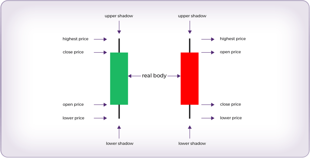
Before diving into the nitty-gritty, let’s cover the basics of what a candlestick is. Each candlestick represents a specific time period (e.g., 1 minute, 5 minutes, 1 day) and provides four critical pieces of information: the opening price, the closing price, the highest price, and the lowest price during that period.
When you look at a candlestick, you’ll notice three main components: the body, the wick (or shadow), and the colour. The body represents the range between the opening and closing prices. The wick shows the highest and lowest prices within that time frame, and the colour indicates whether the market moved up or down—green (or white) for up and red (or black) for down.
The Anatomy of a Candlestick: Breaking It Down

- The Body: The body of the candlestick is the most crucial part as it shows the range between the opening and closing prices. A long body signifies strong buying or selling pressure, depending on its colour. A short body indicates that there wasn’t much movement from open to close, signalling indecision in the market.
- The Wick (or Shadow): The wick represents the highest and lowest points the price reached during the period. A long wick indicates that the price moved significantly away from the open and close but ultimately returned close to one of those points. This can be a sign of market rejection at those higher or lower levels.
- The Color: The colour of the candlestick tells you whether the market moved up or down during the time period. A green or white candlestick means the closing price was higher than the opening price, signalling bullish sentiment. Conversely, a red or black candlestick indicates that the price closed lower than it opened, signalling a bearish sentiment.
Decoding the Candlestick Range: A Closer Look

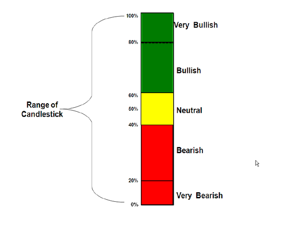
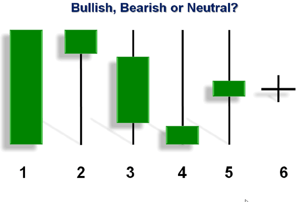
To truly understand a candlestick’s message, it’s essential to analyze where the closing price falls within its range. The position of the closing price can reveal a lot about market sentiment. Let’s break it down:
- If the price closes between 80% – 100% of its range: The candlestick is considered Very Bullish. This indicates strong buying pressure, with the bulls in control, pushing the price close to its high.
- If the price closes between 60% – 80% of its range: The candlestick is Bullish. The buyers are still in control but with slightly less conviction than in a very bullish scenario.
- If the price closes between 40% – 60% of its range: The candlestick is Neutral. This suggests indecision in the market, with neither buyers nor sellers dominating.
- If the price closes between 20% – 40% of its range: The candlestick is Bearish. Sellers are beginning to gain control, driving the price closer to its low.
- If the price closes between 0% – 20% of its range: The candlestick is Very Bearish. This indicates strong selling pressure, with the bears in full control, pushing the price near its low.
This breakdown not only helps in understanding the current market sentiment but also provides a clearer picture of potential future movements.
Why Candlesticks Matter: Reading Market Sentiment

Candlesticks are more than just visual representations of price data—they are a window into the psychology of the market. By analyzing the size of the body and the length of the wicks, you can gauge the strength of the bulls (buyers) and bears (sellers) in the market.
For instance, a long green candlestick with a short wick suggests strong buying interest and minimal selling pressure, signalling that the buyers were in control throughout the period. On the other hand, a long red candlestick with a short wick suggests the opposite.
Common Candlestick Patterns and What They Mean
Now that you understand the basics let’s delve into some common candlestick patterns that can provide valuable trading signals:
- Doji: A Doji forms when the opening and closing prices are nearly the same, resulting in a very small body. This pattern indicates indecision in the market and can be a signal for a potential reversal if it appears after a strong trend.
- Hammer: A hammer has a small body at the top of the candlestick and a long lower wick. It suggests that although the price dipped significantly during the period, buyers pushed it back up, indicating potential bullishness.
- Engulfing Patterns: Bullish engulfing patterns occur when a small red candlestick is followed by a larger green one, “engulfing” it. This indicates a potential reversal from a downtrend to an uptrend. Conversely, a bearish engulfing pattern, where a green candlestick is engulfed by a red one, can signal a reversal to the downside.
My Journey with Candlesticks
I remember when I first started trading, candlesticks felt like a foreign language. I would stare at the charts, trying to decipher what they were telling me, often with little success. It wasn’t until I took the time to study the anatomy of a candlestick and learn the common patterns that things began to click.
One of my most memorable trades was early on when I spotted a hammer candlestick after a sharp downtrend. I was hesitant at first, but I decided to enter a long position, trusting the signal. Sure enough, the market reversed, and I was able to capture a significant profit. That experience taught me the power of understanding candlesticks and how they can guide trading decisions.
Actionable Tips for Using Candlesticks in Your Trading Strategy
- Combine Candlesticks with Other Indicators: While candlesticks are powerful, they are even more effective when combined with other technical indicators like moving averages or RSI. This can help confirm the signals you’re seeing.
- Pay Attention to the Context: Always consider the context in which a candlestick pattern appears. For example, a Doji in the middle of a trend might not mean much, but if it appears after a strong move, it could signal a reversal.
- Practice, Practice, Practice: The best way to become proficient at reading candlesticks is through practice. Spend time analyzing charts, identifying patterns, and seeing how they play out in real-time.
Understanding the anatomy of a candlestick is a fundamental skill for any trader. It’s not just about recognizing patterns but also about understanding the psychology behind price movements. Candlesticks provide a visual representation of market sentiment, allowing you to make more informed trading decisions. By mastering this skill, you can gain a significant edge in your trading strategy.
Are you curious about which signals best support your trading strategy across forex, crypto, and commodities? Join our community at The Signals Oracle, where we provide actionable insights, expert analysis, and a supportive network to help you succeed. Sign up now for our free resources and start your journey towards more informed trading!
Ready to elevate your trading game? Sign up for a trading signals package risk-free today!